
CTAs in Marketing
CTAs should be any marketer’s best friend. They bring your audience into the buyer journey, making it more likely for them to purchase from you eventually. However, not all marketers use the same CTA; the type you use will depend on your end goal.
Whilst some campaigns might be centred around gaining more newsletter subscribers, another might be to entice users to click a ‘learn more’ button on a paid ad, leading to a page about a specific service or product on offer.
Types of CTA
Buttons
This is the most common type of CTA. A good CTA button will accompany an actionable copy (think ‘click here’ or ‘read more’), encouraging them to do just that. When designing your CTA buttons, remember to consider the colour and font design so that it is a departure from the other elements on your site – the whole point is that it stands out, but not in a garish way.
Forms
Form submission CTAs offer users something in exchange for their contact details, such as a white paper, subscription or quote. Once you have your user’s contact details, you can start targeting them with your marketing emails and keeping track of their online behaviour, allowing you to tailor your campaign.
Banners
CTA banners can be found at the top, bottom or side of a given page and feature copy and design elements that entice users.
Your banners don’t necessarily have to be static: you can use video banners with animations, a photo carousel, and a clear button that will divert your users to where you wish them to go.
Contextual Links
This means a hyperlink within the body of text, website copy, or blog post. These links divert your user to a landing page, which is a standalone web page that allows you to follow up on the promises you’ve made in your content.
Landing pages serve a very specific purpose; they should encourage your user to do one specific thing related to your marketing efforts. The more asks you feature on your landing pages, the more likely you will alienate your user once they’ve committed to clicking.
Pop-ups
A pop-up is a window that appears suddenly on a page, catching their attention completely away from the page they’ve landed on. They must press the top right X button to close them down.
Pop-ups that take up the whole screen and that include a countdown timer are said to be 14.41% successful when it comes to conversions, vs 9.86% for those that do not, according to OptiMonk.
Slide-Ins
Following a similar concept to pop-ups, slide-ins come into the user’s browsing experience by sliding in from the bottom or sidebar of the page. You may wish to consider slide-ins if you have unsuccessfully been using pop-ups, which, if designed poorly, can hugely disrupt your user’s experience.
3 Of Our Favourite CTAS
Here are a few of our favourite CTAs.
Lifestraw
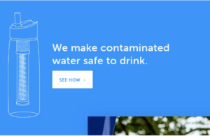
The bold statement and pure simplicity of the design make you want to know exactly how Lifestraw “makes contaminated water safe to drink.”
The simple “see how” isn’t pushy or salesy, drawing on the user’s curiosity rather than their volition to make a purchase.
Grey Goose
Personalised CTAs will always catch a user’s eye and intrigue. Like the Lifestraw ad, it does not use direct language that suggests you will receive the full sales pitch from the brand. It simply tells you they can offer something to your tastes.
Spotify
In contrast to the two examples of effective CTAs, Spotify takes a more sales-orientated approach.
The ‘Get Spotify Free’ CTA could easily be a put-off, as most people know that by now if something is being pitched as ‘free’, there will be a catch. However, the ‘No credit card needed’ negates this somewhat, reassuring you that you don’t have to make a financial commitment to access the ‘free’ benefits.
Need some CTA support?
Here at Caliston, our creative team have been designing successful CTAs, landing pages, and paid ads for over 15 years. If you need a bit of guidance or don’t have the time to address this aspect of your marketing, contact us for the help you need to get your business thriving online.





Follow Us