A major aspect of any online marketing campaign is your website. It is a 24/7 billboard that has to make a good first impression for your brand/business. And the most important page on your website has to be your landing page.
Landing pages, the first page a new site visitor will see, help businesses create effective marketing strategies by instantly promoting products and services. It is a vital part of the website creation process as this is your chance to entice visitors and push them down your conversion route.
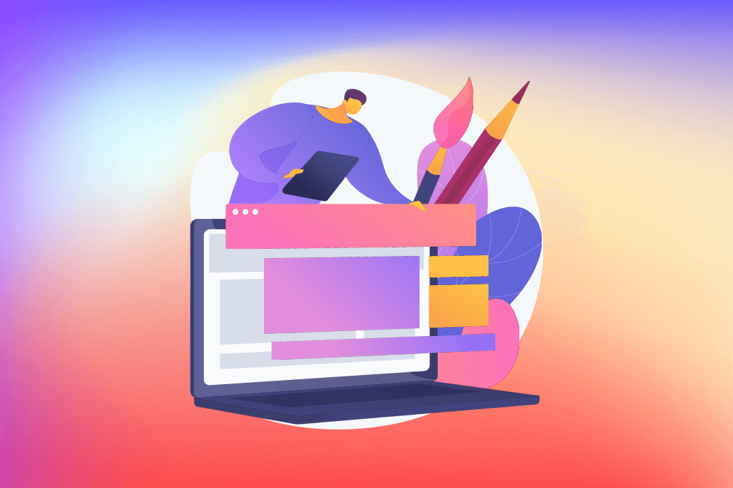
Your landing page needs to be curated perfectly. So, today, we’re going to be sharing some tips and advice on designing an effective landing page that can convert site visitors and increase engagement for your brand/business.
1. Recommended Landing Page Content Layout
The content on your landing page has to be succinct but also informative. It takes just 8 seconds for a new user to make a decision on your website regarding your service. As you only have 8 seconds, you have to be smart with the way you present your content. Information overload will overwhelm your visitors. They won’t know where to look for their answers and will instead opt for one of your competitors because they aren’t bombarding users with blocks of text and pop ups.
Use informative, simple and plain language to push your service to the visitor in seconds. This is easily managed when we break down the layout of an effective landing page. The first thing a user will see is the ‘Heading’. Use the ‘Heading’ to push your service’s biggest benefit so visitors know exactly what they can get from you.
The second element to include on your landing page is the ‘Subheading’. Whilst the ‘Heading’ will push your USP (Unique Selling Point), your ‘Subheading’ will explain the offer further and may even showcase a different angle to your USP. It is important that the ‘Subheading’ is complementary to the ‘Heading’ but also understandable if read on its own.
Below, or at least somewhere on your landing page, it is vital to have a CTA (Call to Action). Clickable buttons that encourage visitors to complete an action, such as signing up or contacting, have to be incorporated into the website. It is recommended to include CTA’s both at the bottom and top of pages so users don’t have to go out seeking them. Alternatively, you could even make the CTA a constant floating element on every page. Adding an animation or variety of design to your CTA buttons can also engage site visitors.
The ‘Heading’, ‘Subheading’ and ‘CTA’ should be the main content a visitor sees when they first land on the page. As they scroll through the page, they should be met with the ‘Benefits’ of your service. Here is your opportunity to go into your USP with detail. Use bullet-points to sell your service but keep the list short so as not to bore users. Start with your strongest benefit first and work your way down the services on offer.
If all of the aforementioned elements have done their job and users have kept scrolling down your landing page, it is the perfect opportunity to chuck in a form or contact element. The whole point of the website is to generate leads and customers. What is the point of a great site if you’re not taking the opportunity to create a customer base? Use a lead generation form to ask for visitors’ emails and names so you can keep them in contact lists.
Remember to keep your ‘Heading’, ‘Subheading’, ‘CTA’ and ‘Benefits’ within the same tone of voice and focus so as not to confuse and deter visitors.
2. Minimalism is King
The best landing pages are both minimalist and aesthetically pleasing. If you go full steam ahead with all the bells and whistles available to you in website creation, you will leave your content redundant. Use clean and simple visual elements surrounded by clean white visual space to draw eyes to the parts of the site that matter most – the content selling your service. Furthermore, a simple and understated design will also decrease your page’s loading time. Nothing says ‘Close Tab’ faster than buffering.
Opt for a thick and big font to make it easier for visitors to read and understand your content on any device. Also utilise blocky backgrounds on your landing page to separate the different content stages and make the visitor feel like they’re scrolling through a journey.
3. Image Selection is Key
Visual content is key in every aspect of online marketing and creation. Photos can enhance the way visitors engage with your product just as much, if not more, than your actual copy. However, it is very important to select your images carefully as the message it sends is entirely what the visitor draws from it. You can of course manufacture the response by selecting images very specifically. A graphic designer or professional photographer will know exactly how to highlight your product so as to offer the best chance of engaging potential customers.
4. Creating Trust
The chances are that new visitors have come through to your landing page via a search engine. Once they get to your site, it is your duty to create trust and present a service that is trusted by others. This is where you should use client reviews and partner testimonials to display social proof of work and collaboration.
Use testimonials, trust marks, and badges are what we call ‘Trust Signals’ that put visitors at ease. They create trust and provide your brand with numerous stamps of approval. It generates confidence in your brand and encourages users down the conversion funnel.
5. A/B Testing
Once you have created a landing page, you need to conduct some A/B testing to generate analytics on how users use your landing page. During the testing phase, you should look at how often visitors action CTA buttons, what content was watched and interacted with, and how many users filled out your contact form.
You should also use the testing phase to see how most users came to your site. For example, is it more popular amongst mobile users than desktop ones and can you adjust your strategy as a result?
6. Smartphones rule the waves
Half of all web activity comes from smartphones. If you’re not considering mobile layout and users in your landing page, you simply won’t see much success. Your landing page has to have an adaptable mobile design that loads quickly and is easily usable. It is even easier to leave a page on mobile if it simply isn’t loading well enough or enticing enough.
7. Social Media Buttons
Once you’ve got a visitor to hit your landing page, you must take the opportunity to push all your other social profiles. You can do this through clickable social buttons at the bottom of your landing page as is the most common choice. Or you could incorporate them as floating elements on every page if you are a heavily social service.
It is also important that you don’t overwhelm visitors with every single social network profile. Highlight the ones that your target audience use the most and direct them to your profiles there.
8. The right type of video
Embedding a video into your landing page can perfectly showcase a product or service in a way that text and images can only do so well. When designing this video content, it is good to keep in mind the emotional cues that website viewers respond to; when it comes to landing page videos, awe-inspiring videos have a 25% chance of being clicked, whilst funny videos have a 17% chance, joyful videos have a 14% chance and angry videos have a 6% chance. Like any content being pushed on your site, video content has to be produced and presented carefully and in line with the brand’s target audience.
9. Campaign-specific landing pages
If your service is a fractal one offering many different sub-services that you ant different customers landing on, it may be beneficial to create individual landing pages for each service. Not only does this keep content focused on the separate landing pages, you can also see which of your services is the most engaged with and which needs help finding customers.
However, remember to keep a uniform design across all the landing pages so as not to confuse visitors. They must always realise the services are being provided by the same parent company.
10. Limit distractions and exit opportunities
To keep visitors on your landing page, it is recommended to remove exit opportunities. This can mean that when a user starts scrolling down your page, you remove the navigation bar so as to keep the user scrolling. Also stay away from external or internal links as you want the visitor to be solely focused on the landing page and the contact form at the bottom. Your only focus should be converting customers through your funnel system.
The decision to minimise exit opportunities is the reason that many landing pages push their social network buttons to the very bottom of the page. The longer they stay on the landing page before they follow you on socials, the better it is for your conversion rates.
Landing Pages in Conclusion
An experienced online marketing agency will have A/B testers, copywriters, graphic designers and website creation experts that can take your brand and tone and present an enticing landing page.
At Caliston Ltd, we have helped many businesses increase conversion rates by formulating bespoke websites and landing pages that effectively attract target audiences and meet targets.
Author: Kostas Alekoglu

Kostas Alekoglu has been helping businesses market their products and services since 2003. He is the founder & CEO of Caliston Ltd, a marketing agency. During his career, he has appeared on BBC News, the BBC World Radio Service, as a conference speaker & lecturer.
He has experience in strategy, advertising, UX, SaaS development, predictive analytics & automation. Kostas is one of the first marketing people in the UK to use Google, Facebook, Twitter & Linkedin Ads.
Follow Us